Often when I choose a script, I’m drawn to its content, which reflects the depth of the director’s world view and how compelled he or she is to bring a particular story on to screen. Much before I had read the detailed script, Ravi Udyawar (director of Mom) had given me a brief narration of the story and synopsis with utmost sensitivity. The story idea, the conflict, the plot and its resolution drew me in immediately. Further, upon reading the script, not only was I extremely moved by the exposition of the central conflict but also by the sheer complexity of emotions and the weight of the narrative. Given that the plot point on which the film pivots is a particularly heinous crime, I felt extremely compelled to being a part of the team working to bring this moving drama to life through a profound mother-daughter relationship. Despite the obvious seduction of the project, what matters to me most is the director I work with. Apart from knowing Ravi as a prominent advertising film maker of the country in the last decade or more, I also found him to be an exceedingly sensitive human being, a man of great integrity and an artist of rare vision. Our world views and energies seemed very akin in our human endeavor to tell meaningful stories. And soon after I was on board, both of us reveled in his cause to tell this story as artfully and sensitively as we could.
Prior to films, both Ravi and I come from College of Art backgrounds and thus we were perhaps equally keen on the exposition of this narrative through visual poetics. The film takes you through various emotional tones and in our attempt to find the visual vocabulary, both Ravi and I sought inspiration from our intrinsic Indian theory of ‘Rasas’ or aesthetics. The rasas Mom deals with are Vatsalya (Parental Love), Bhayanka (Horror), Vibhatsa (
Ravi is a gifted artist and illustrator himself and is clearly able to communicate his ideas which would then evolve compositionally through the lens. We are both suckers for detail as we believe everything within a frame constitutes ‘the frame’. In other words, it’s not just the choice of the lens’ focal length, camera angle or lighting that makes the frame. It’s once all of that is done, everything within that frame makes ‘the frame’, appropriate to guide the viewers attention towards our intentions. We’ve attempted to texturize the film through the poetics of visual metaphors hoping it will find resonance with certain audiences even if at a subliminal level.
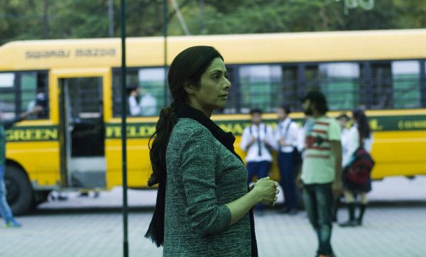
In terms of contrast of light or movement, we’ve dealt with a lot darkness to stimulate the audience imagination with fear and the foreshadowing discomforts of the unknown. The film is essentially a drama, mystery and thriller so, it allowed for a lot variety in camera movements from soft and gliding ones to those that are stealthy and surreptitious. The attempt in a whole lot of handheld scenes was to make the camera feel subjective for the viewer to witness the anguish of the characters involved. There is one such three and a half minute handheld take – a scene between the mother and daughter – that we hope shall evoke in the viewer the same agony felt by our characters on screen. In terms of angles, Ravi and me were very sure that we wanted certain scenes or shots to be seen only in top angle as ‘God’s POV’ as it were. Speaking of contrast, as the the plot gets grittier, you will notice extremities of exposure coexisting in a frame with an intent to intensifying the viewers gaze.
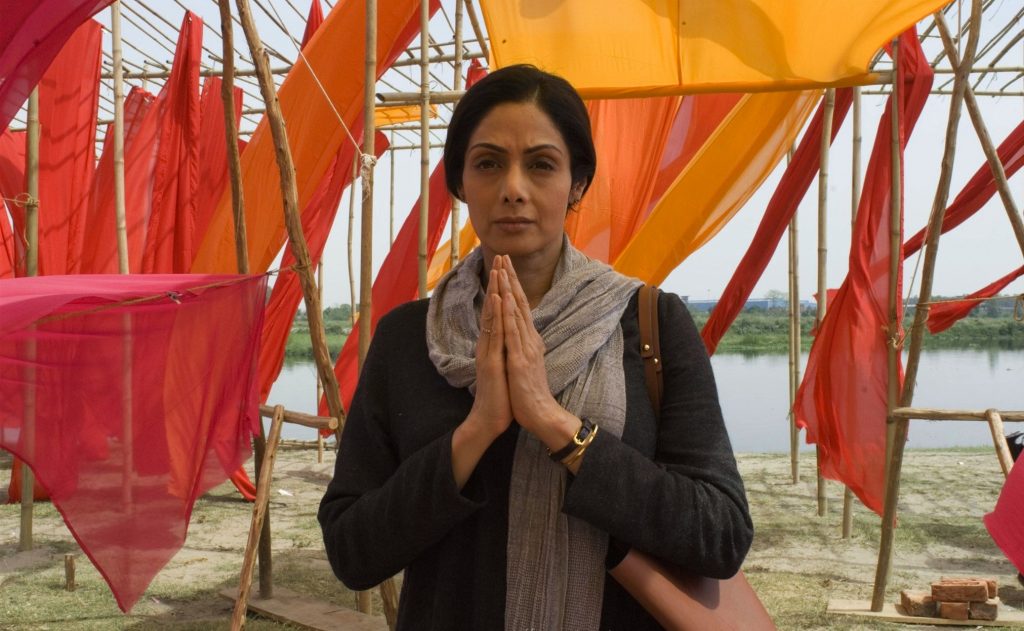
I consider it a great fortune and honor to have worked with a talent as supreme as Sridevi. The moments of delicate artistry, improvisation and the deftness of nuances that I have witnessed her perform through my lens, has given me goosebumps and even moved me to tears while operating my camera through a take. Nothing can inspire the director and cinematographer more than an actor possessed. Everything Sridevi does is with sanctity and grace whether in front of the camera or away from it. On a more specific note regarding Ravi and my prep with her on the film, we had done some very elaborate look tests with her to explore her threshold towards different lighting styles and contrast, in flattering and non-flattering light. Soon we realized that even though some of our grittier visual vocabulary was new for her to see herself in, she was all for it and herself very keen that as her journey in the film intensifies, her look must appear more and more harrowed and drained. It was a sheer pleasure for us to have a star of her stature support our visual design, dispossessing her concerns of looking her best. She was only interested in looking right for the scene and the emotional graph being etched just as Ravi and me were always concerned with the visual language feeling right rather than a visual looking great. It’s my firm belief as is Ravi’s – If it’s feeling right, it’s looking good!